Role: Web designer, UX/UI
Background
Vita-Auto is a company that specialises in selling cars. They offer a wide range of vehicles to a diverse customer base. The company's website was originally designed for desktop use and needed to be adjusted for mobile devices to improve accessibility and user experience on smaller screens.
Problem
The main challenge was adapting the desktop website for mobile use while keeping its functionality and visually appealing. Displaying a large amount of content on smaller screens required innovative design solutions to maintain a clean and user-friendly layout.
Approach
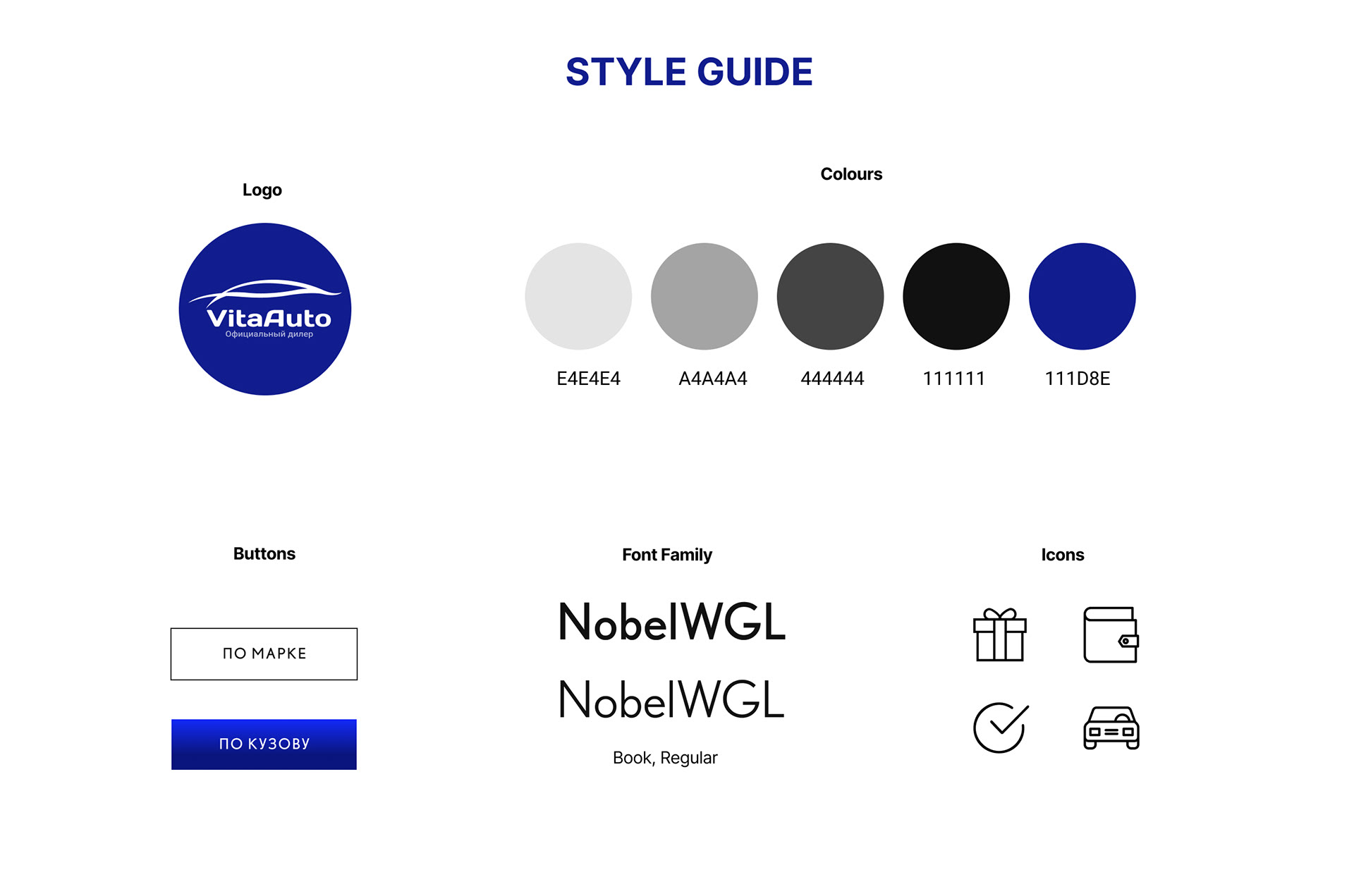
To find the best solution, I conducted an in-depth analysis of the desktop version, ensuring key elements and functionalities were retained. I designed a style guide, created wireframes, and performed user testing to adapt the design for mobile devices. As the sole designer on a team of developers, I was responsible for all aspects of the design process, from conceptualisation to final implementation.
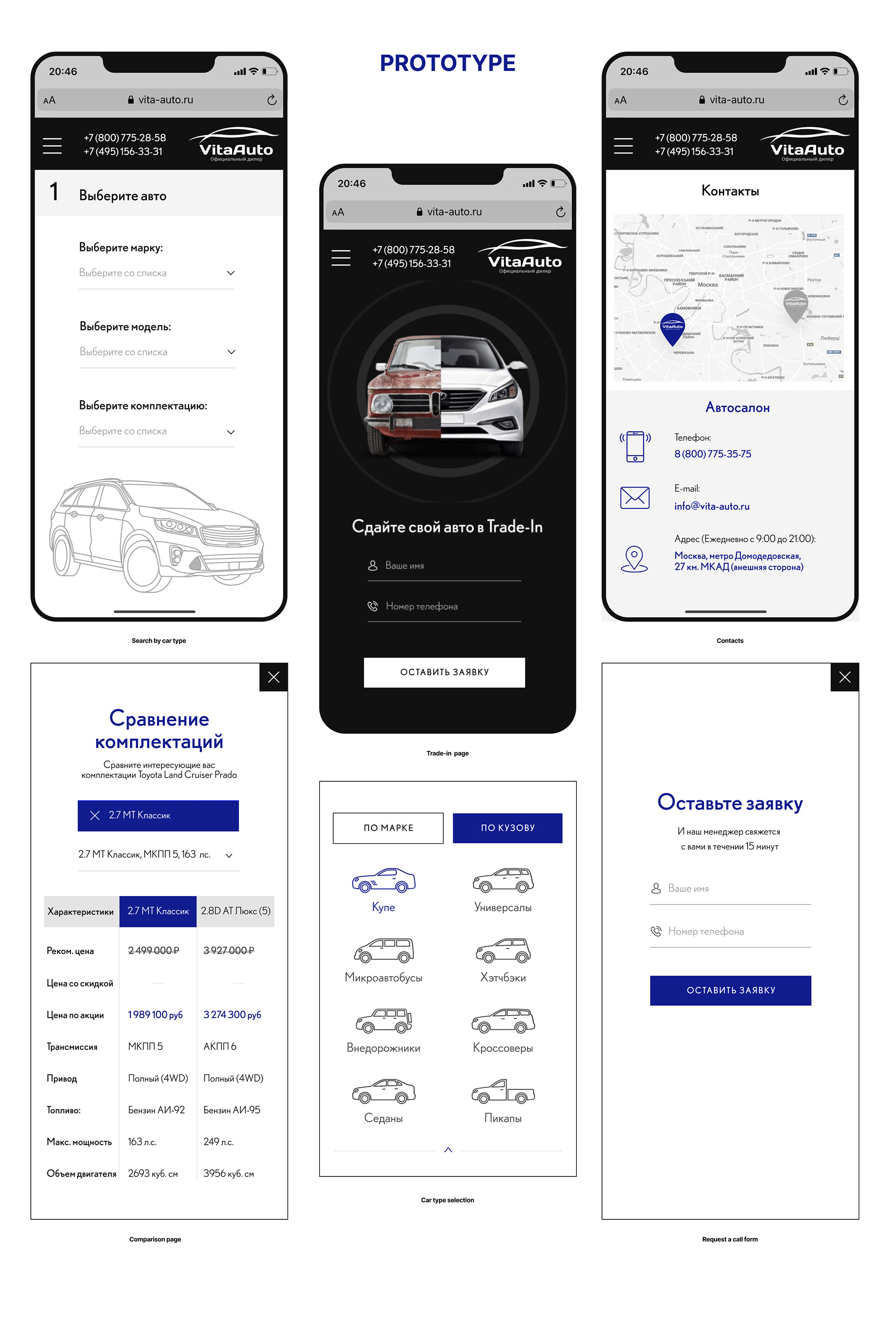
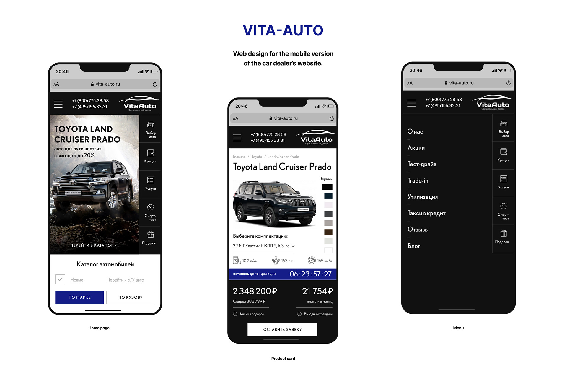
Solution
The solution for Vita-Auto's mobile website adaptation focuses on maintaining functionality and visual appeal while accommodating extensive content. Utilising a style guide with a black-and-white colour scheme and blue accents, the design incorporates two menus for navigation, ensuring clarity and accessibility across all sections.
A set of visually engaging icons and car visuals replace text where possible, reducing clutter. The prototype emphasises intuitive navigation, touch-friendly elements, and clear call-to-action buttons to optimise the mobile user experience, ensuring Vita-Auto's website remains engaging and user-centric.